I wanted to document some of the birds I've found around Hockley.
I gave Birds of Hockley the following features:
Search Feature - You are able to search for any bird stored in the CMS. This makes it easier to find a specific bird.
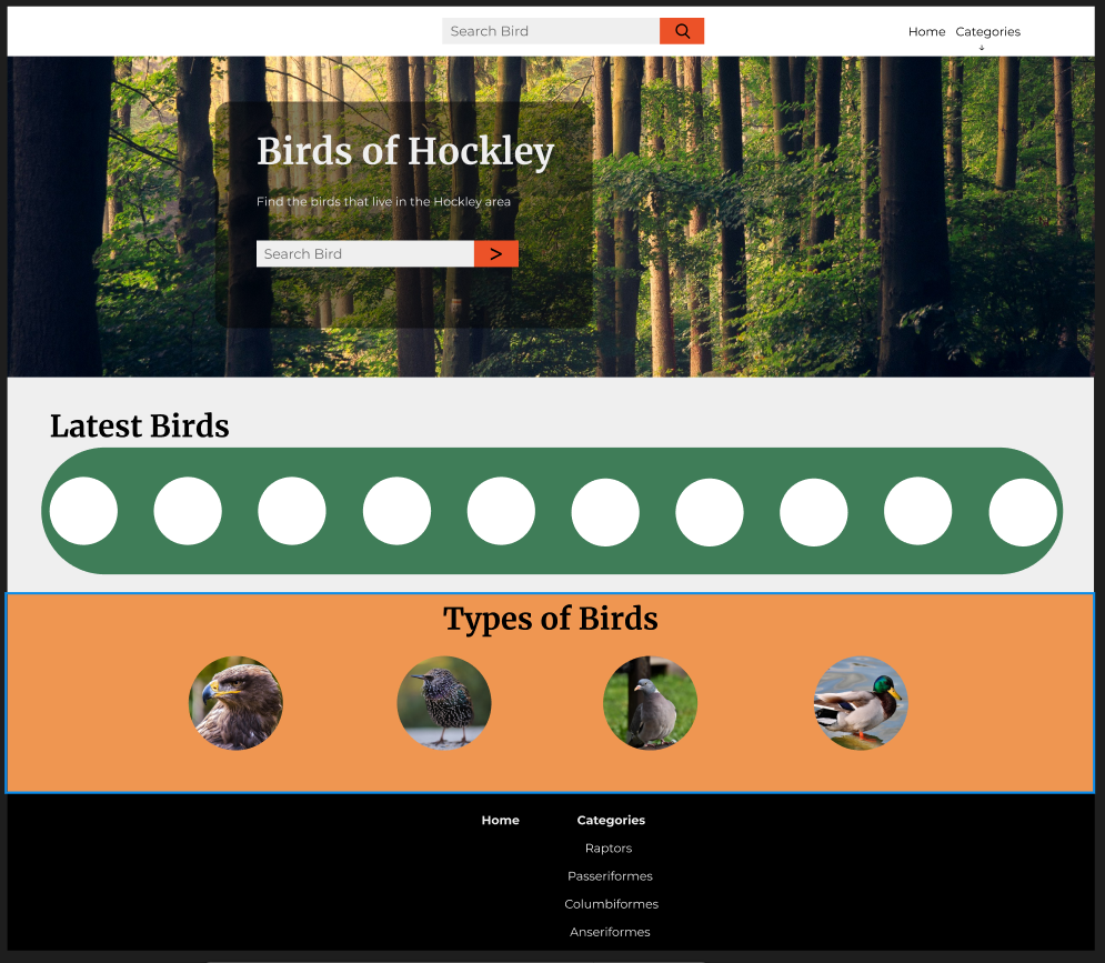
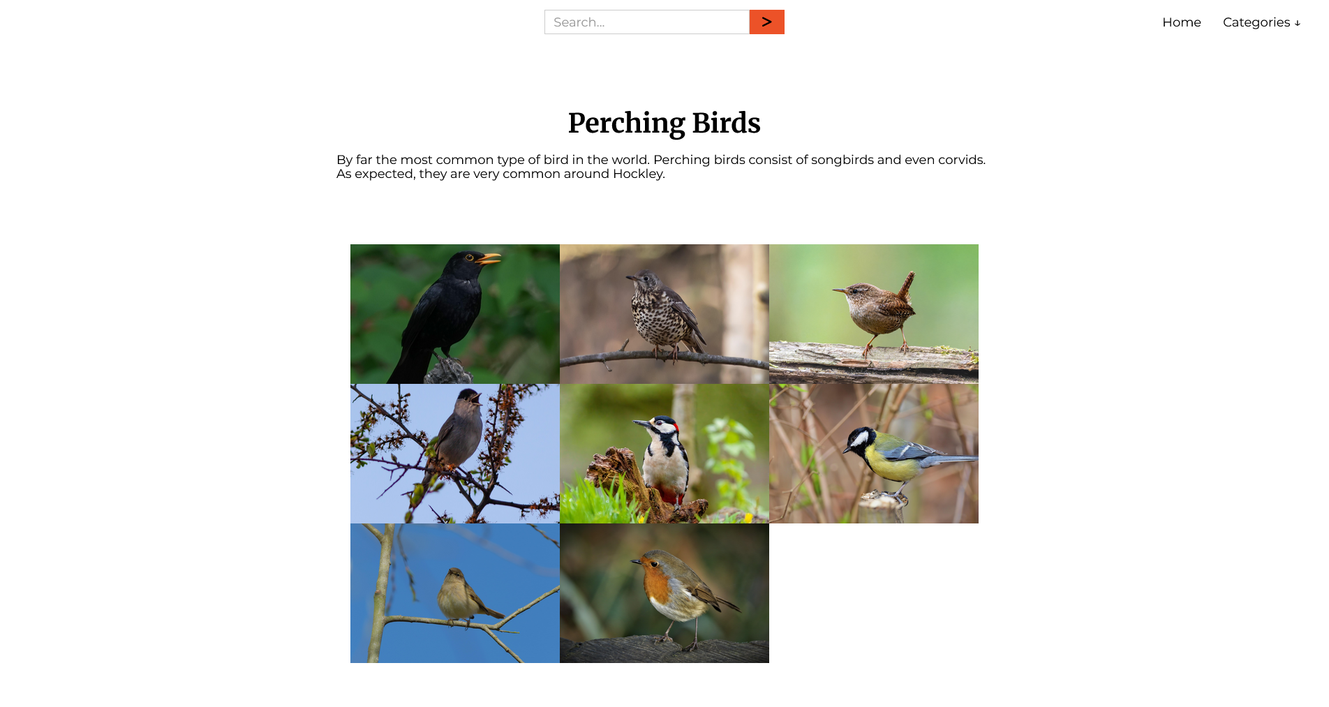
Categories - I split the birds up into four categories. I may re-do these categories later.
Navigation - I tried making the site as easy as possible to navigate without excessive clutter.
Resources I used:
Figma - To design the site
Webflow - to build and host the site.
Jetboost - for the search functionality.
Pixelcut AI - to enlarge the background image.
Section Divider Bae - to create the section separators.

Process
I've always enjoyed seeing the birds around Hockley, so I decided to start cataloguing them. The process for finding the birds was quite simple: I just needed to head into the nearby Hockley woods while using the Merlin app. It listens for the calls of different bird species. I took note of the species it identified and kept it handy for when I would put them into the CMS.
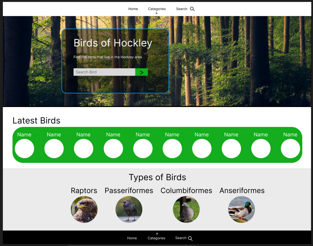
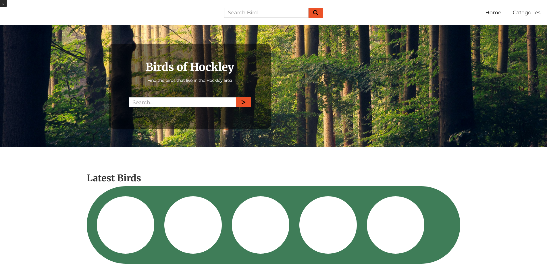
I started off by designing the website using Figma. For this project, I took inspiration from other animal-related websites, like zoo websites. This is why I decided on the "wiggly lines" separators for the homepage. I thought it gave it an interesting look. It also helped distinguish between different sections without relying entirely on colour.
As for the colours, I chose green, soft orange and red orange, as well as the usual black and white. The green reflects the woods in Hockley. I felt it gave the site a nice "natural" feel. The two orange colours are more related to the birds, as some of them can be quite colourful. The red orange I used as an accent, or a colour that stands out against the background.
I used Merryweather font for the headings, and Monserrat for regular text. Merryweather had a little more flair, as I wanted to portray some level of elegance in this site. The regular text, however, I kept simple with Montserrat. This was for readability purposes.
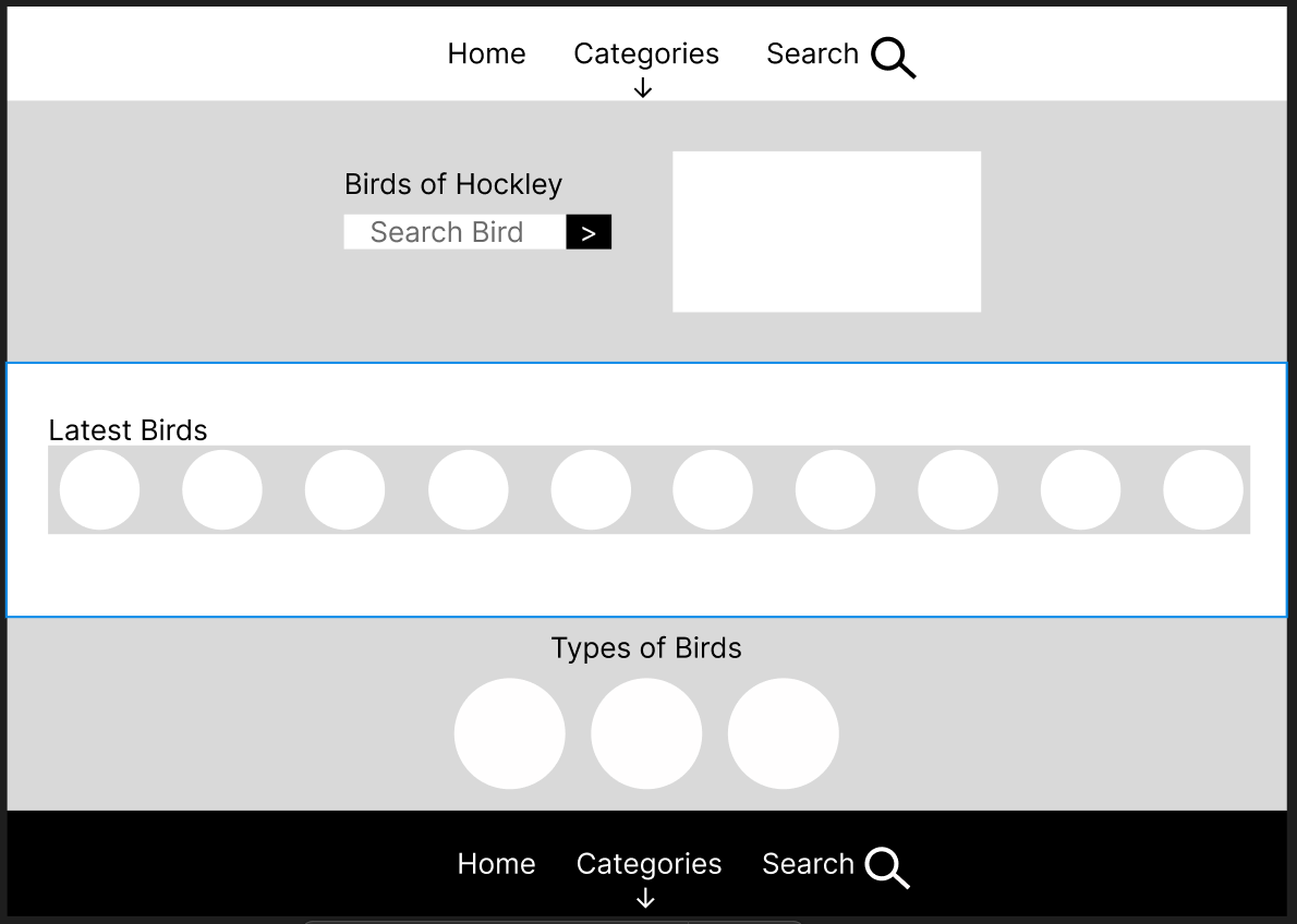
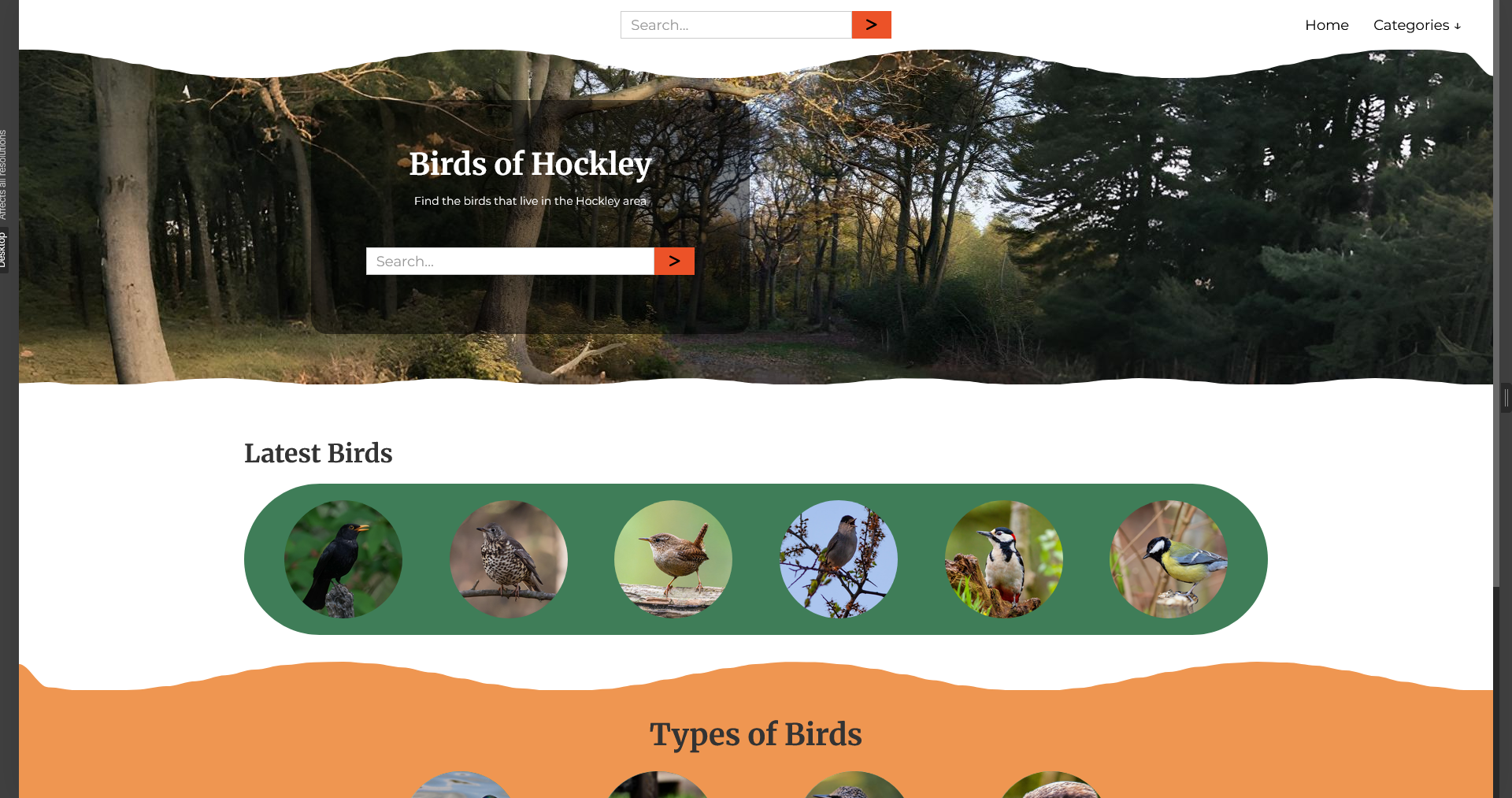
When designing the header, I imagined I would have the search feature appear at the top of the page, as well as in the Hero Section. I wanted the search bar in the middle of the header, with the navigation to the right. This would be changed during development
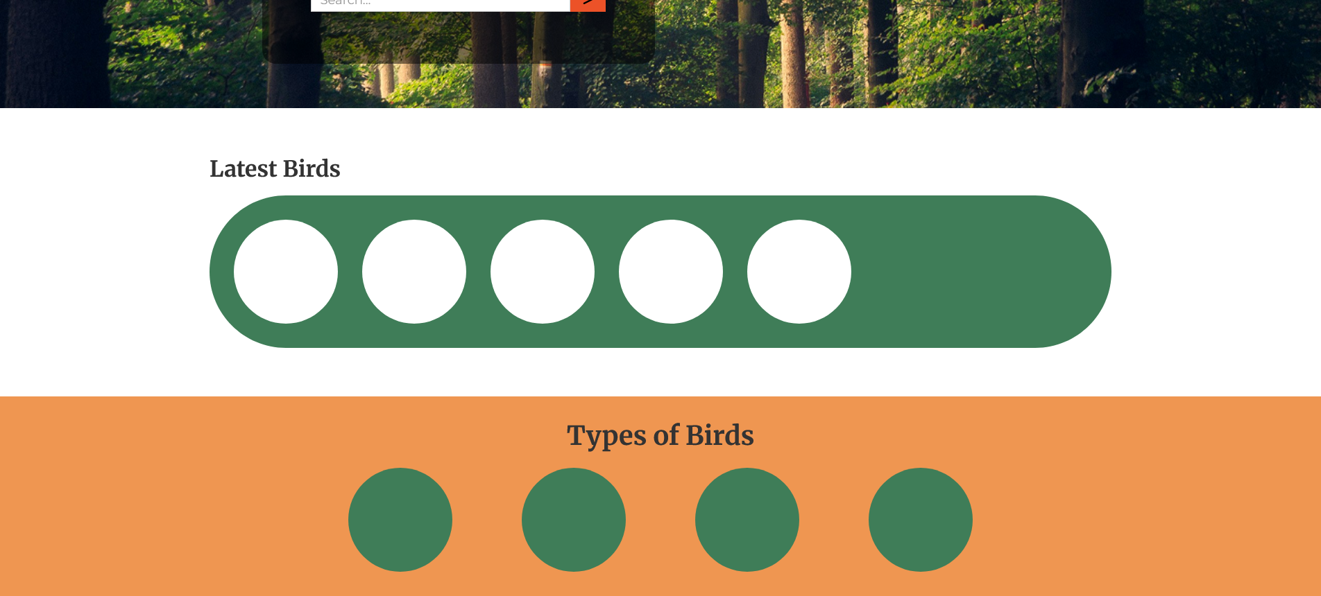
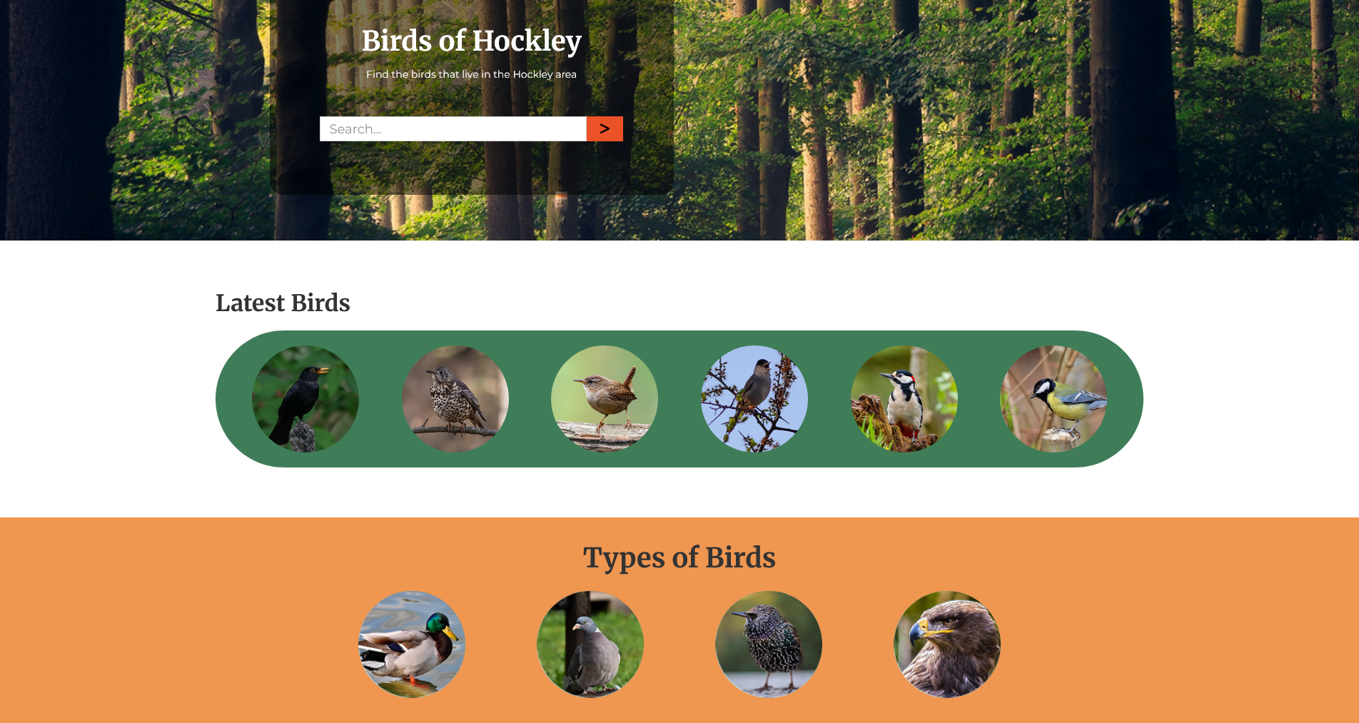
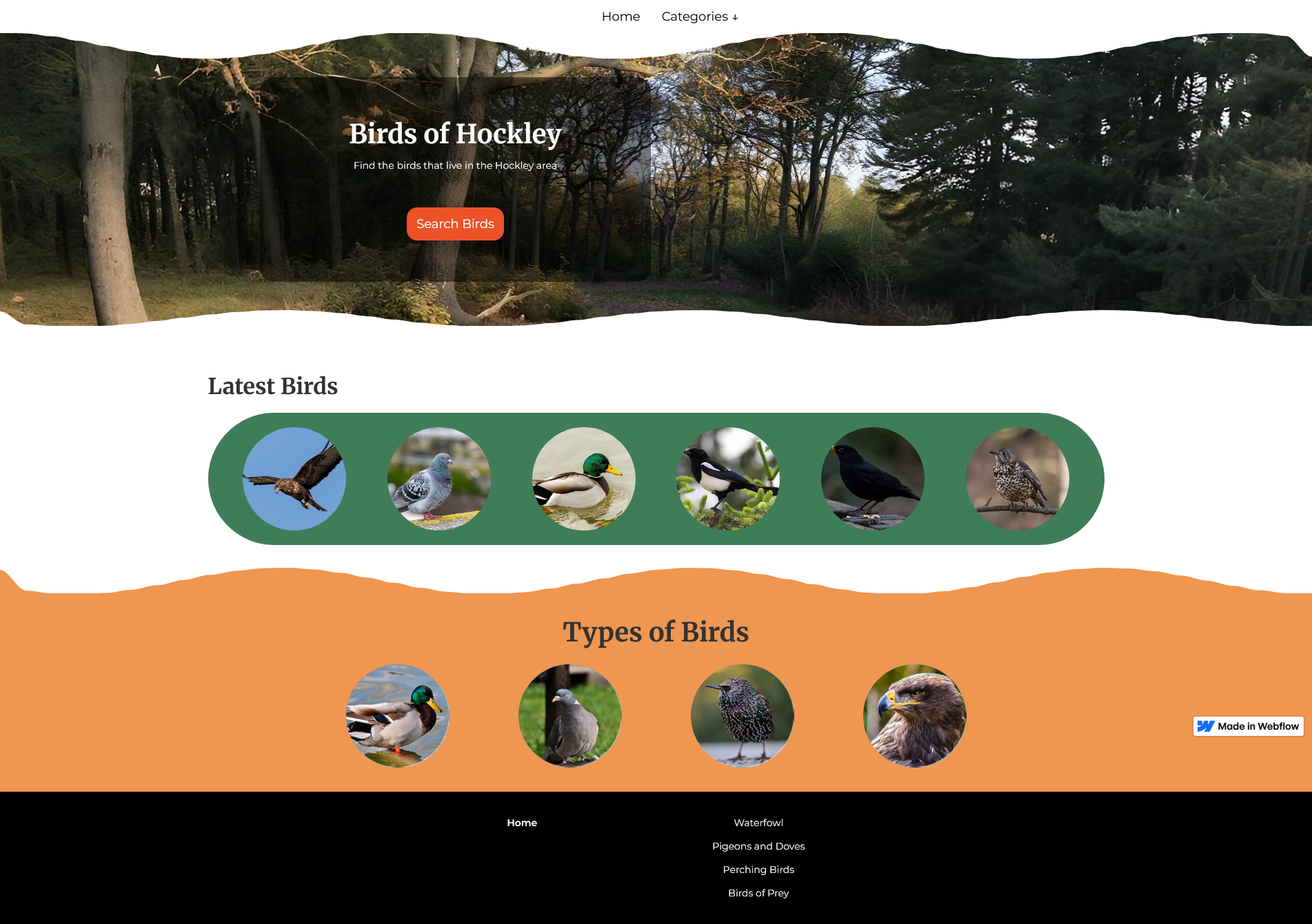
For the Hero Section, I wanted an opaque card over a background image. The image would be of Hockley woods, but I didn't have access to a suitable image while I was designing. I used a placeholder until I could get one. The opaque card would appear just left of centre. In these Figma designs, you can see a search bar appearing there, as well. Again, I changed this during development.
I then designed the next two sections: the "Latest Birds" section, and the "Categories" section. The items within these sections would show their name on hover.
For tablet and mobile, I figured the change would be quite easy. The navigation would become a hamburger menu, and the Hero section card would move to the centre of the screen.
In all, designing the site was quite easy. It took only around 1-2 hours to get some mid-fidelity mock-ups.
After the design process was complete, I set about building this in Webflow. At the time, I believed I could get the search feature to work from the homepage. I would realise that this needed to be changed as I continued developing the site.
To make the navbar how I wanted it, I made it a flexbox. I created an invisible third div block on the left of the flexbox. This allowed the navbar to be placed in the centre of the header, and the navigation to be put on the right.
To create the Hero section, I made it into a grid. I put a div block on the left column but set the height to 70% and the width to 60%. The opaque background needed a bit of tinkering to get working. Setting a lower opacity on the parent div also lowered opacity for all elements within it. I therefore needed to create a "pseudo-background" div. Setting the position to absolute, I was able to make it cover the entire card without altering the opacity of other elements.
I quickly put together the skeleton for the next two sections. These sections were quite easy to get working, with the "Latest Birds" section using a responsive grid. The "Categories" section used a flexbox.
To create the hover effect for all items in both categories, I created a div inside each item. I set their height to 50%. They have a text block inside that shows their name. The block containing the text was given a background colour of black but made translucent.
Initial state for this block is set to hidden, but it will appear while the item was being hovered over. It will disappear when you hover out.
I was encountering issues getting the navigation menu to work properly. It would be cut off on one end and go over the screen on the other. I needed to increase the size of the menu container to get it to display correctly.
It was at this time that I received a few photos of Hockley Woods. Unfortunately, they were too small and would not fit over the Hero section’s background. After doing some research, I found Pixelcut. Pixelcut takes an image and automatically generates a larger version of it. I decided on the photo that is displayed on the website mainly due to the colours. There was just a little bit of orange/yellow to it, which fit in with the colour scheme of the website.
My next task was to set about making the "wiggly” separators. I first tried using external tools, but I encountered many alignment issues. After looking for more tools, I found the "Section Divider Bae" plugin, which creates these separators and aligns them automatically. After some tinkering, I was able to get the separators to look how I wanted them to.
With the homepage set up, I moved on to create the CMS categories pages. It was simple. I created a grid to display each bird in category. Using the same hover interaction I used for the homepage, the categories pages were done very quickly.
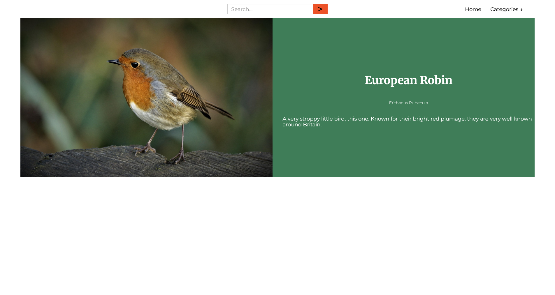
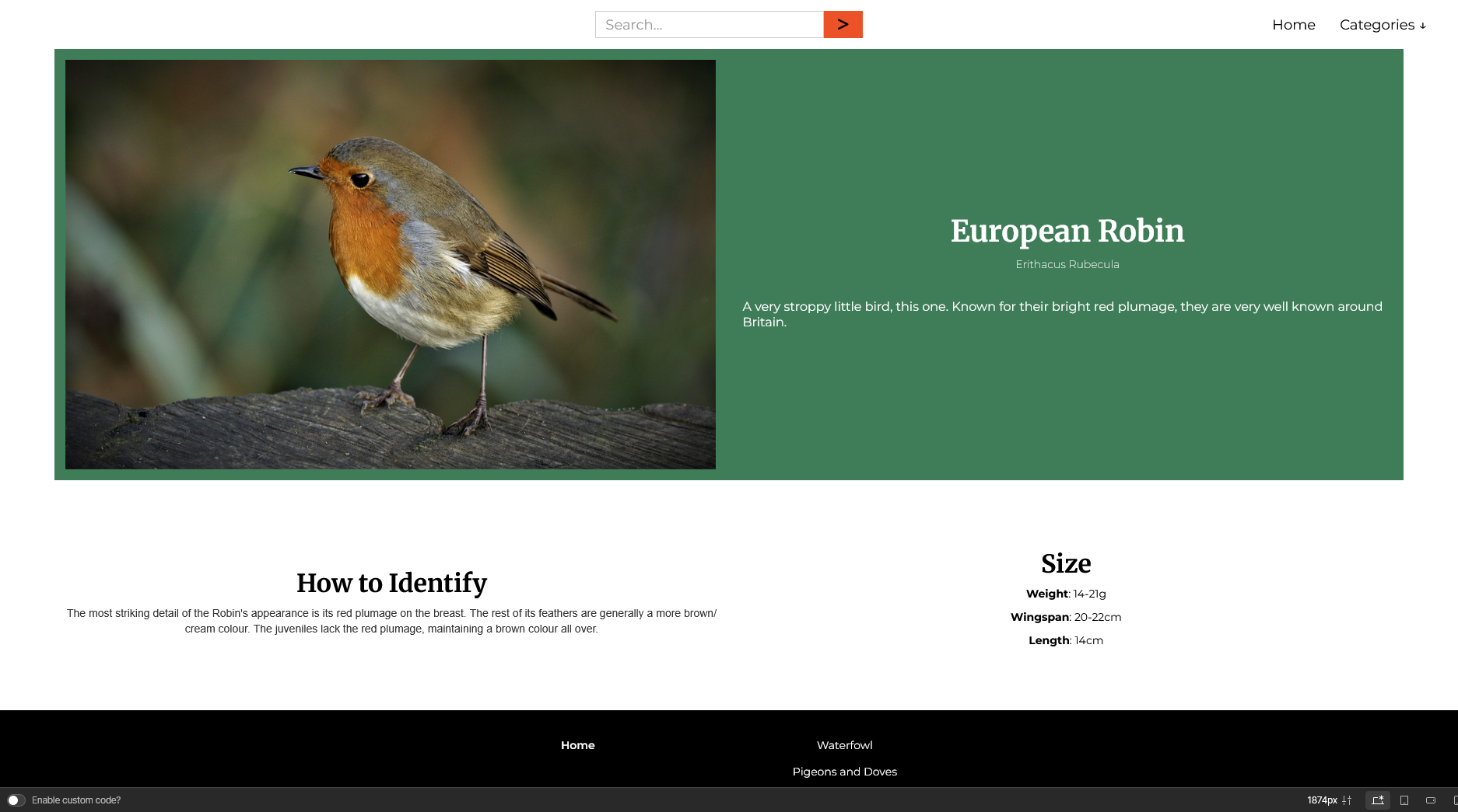
I then created the bird species CMS and the bird species page template. I used a grid for the intro section, and a flexbox for the extra details. I got most of the information from sites such as the RSPB website, as well as the Essex Wildlife Trust. The images I found from Pixabay.
Finally, I was ready to start building the search feature. I needed to purchase a workspace plan to enable custom code, as this was necessary for any such search functionality. After some more research, I decided on Jetboost to enable users to search for individual birds. It was here that I redesigned some of the homepage. Moving the search bar to a separate “search" page meant that I had to re-adjust the header and Hero section. I removed all elements from the header except the navigation. This put the navigation menu squarely in the centre of the header. I then replaced the search bar in the Hero section with a button that takes you straight to the search page.
I was then done building Birds of Hockley. I spent a bit of time testing the site, and adding a few more birds, before eventually publishing it.
By the end of this project, I had learned considerably more about Webflow. I can say I am quite comfortable with Webflow now, after having built this site.